


The stock market is full of investors who jump at random occurrences to try and catch a lucky break. Chances are, they will probably lose more than they win with that mindset. This is especially true with penny stocks and their volatility. This is why it is essential to learn how to buy penny stocks correctly. And learning some of the most critical and common chart patterns is an excellent place to begin.
Identifying penny stock chart patterns is essential to any successful trader’s arsenal. Because educated traders use these patterns, it fills a sort of self-fulfilling prophecy but for trading. While nothing is ever 100% guaranteed, patterns will help you win in the market more than without them. So, below are 5 of the best penny stock chart patterns.
– Using News to Find Penny Stocks to Buy: 3 Tips
Double Top & Double Bottom Chart Patterns
What is a Double Top Chart Pattern? A double top visually appears in the shape of the letter “M.” This occurs when a stock reaches its resistance point twice. It also fails to break it, which typically results in the shorting of the stock. The following trend is usually a sharp price decline.


A double bottom chart pattern would be the opposite, appearing as a “W.” A stock can have a substantial price increase when it bounces off its support level twice in a given period. This is usually due to buyers seeing sellers failing to break the support line. Or, instead, investors see that there is a solidified level of support for a particular penny stock.
– 5 Hot Penny Stocks To Watch This Week With Big News

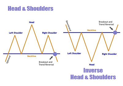
Head & Shoulders Chart Pattern
A head and shoulders stock chart pattern is a trend reversal pattern. It is shown on a chart by having its highest high sandwiched between two similar previous lower highs. The left side of the head and shoulder shows where the market was in a bullish trend. When the chart reaches the highest high, the market shifts to a bearish direction; hence, this pattern indicates trend reversals.
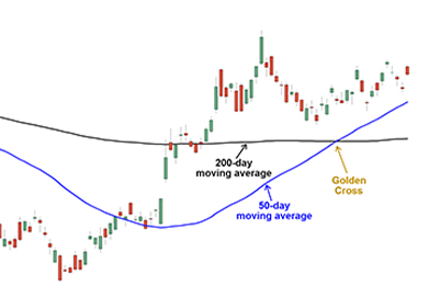
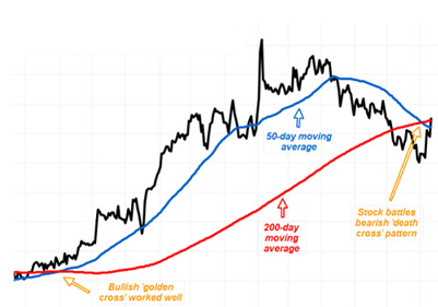
Golden Cross & Death Cross Chart Patterns
The golden cross chart pattern occurs when a shorter time frame moving average (50-day) crosses above a longer time frame moving average (200-day). This crossing strongly indicates that the chart has probably entered a bullish market.
The opposite action would be known as the death cross. This is where the shorter-term moving average crosses below the longer-term moving average. This is typically a solid bearish market indicator.
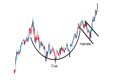
Cup & Handle Chart Pattern
A cup and handle pattern is usually visualized as a parabolic “U” shape with a lip to the right of the “U.” This is due to the chart hitting the resistance line the first time, resulting in the stock price decreasing. Then it has a consolidation period followed by a bounce back up to the resistance line again. The chart will then form the lip/handle, a bullish flag or pennant. The stock traditionally rallies past the resistance line for a bullish breakout.
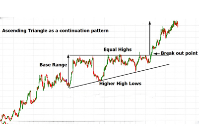
Ascending Triangle & Descending Triangle
An ascending triangle penny stock chart pattern is seen when a stock has practically flat highs while its lows continuously get higher. This happens until the low gets to the point of touching the continuous flat high. Once a chart reaches this point, it typically displays a strong bullish breakout achieving a new high.
A descending triangle pattern would be characterized by having flat lows while the stock’s highs get lower until they meet the flat low. If this happens, the chart will likely reflect a bearish breakdown and establish a new low.


One reply on “How Do You Analyze Penny Stocks? Start With These 5 Chart Patterns”
I am interested in penny stocks with a Rare Golden Cross Chat Pattern